The statistical, machine learning, and data engineering ideas
that guide my portfolio projects.
Why This Section Exists
This section is a growing collection of the concepts I use while building data projects. It connects theory with practical decisions: how I choose evaluation metrics, prevent data leakage, handle class imbalance, validate models, engineer features, design data pipelines, build SQL summaries, model dashboard data, and interpret results.
The goal is not to document everything I study. The goal is to make visible how I think through data problems and turn technical concepts into clear, defensible analysis.

Traffic Waiting Time Prediction in Quito
This regression project predicts traffic-related taxi waiting time in Quito. The target, wait_sec, is continuous and measured in seconds, so the workflow uses regression metrics that are directly understandable for transportation and user-experience decisions.
Concepts used in practice: regression framing, MAE and RMSE, geographic data validation, domain-based coordinate cleaning, implied-speed outlier treatment, datetime feature engineering, route-based features, geospatial analysis, scikit-learn pipelines, model comparison, RandomizedSearchCV tuning, external holdout evaluation, and permutation importance.
Why it matters: the project does not only fit a model. It checks whether trip records are realistic, uses Quito-specific geographic rules, compares regression models, validates performance on an external holdout set, and explains which temporal, route, and location features drive waiting-time predictions.

Hotel Booking Cancellation Prediction
This classification project is built around a business question: which bookings are likely to be canceled? The most important methodological idea is to avoid using information that would not be available at prediction time.
Concepts used in practice: supervised classification, target definition, feature availability, data leakage prevention, stratified splitting, class imbalance, SMOTE inside cross-validation, precision, recall, F1-score, ROC-AUC, confusion matrix analysis, and feature importance.
Why it matters: accuracy alone can hide poor performance on canceled bookings. Recall, precision, and ROC-AUC give a more honest view of whether the model can support business decisions.
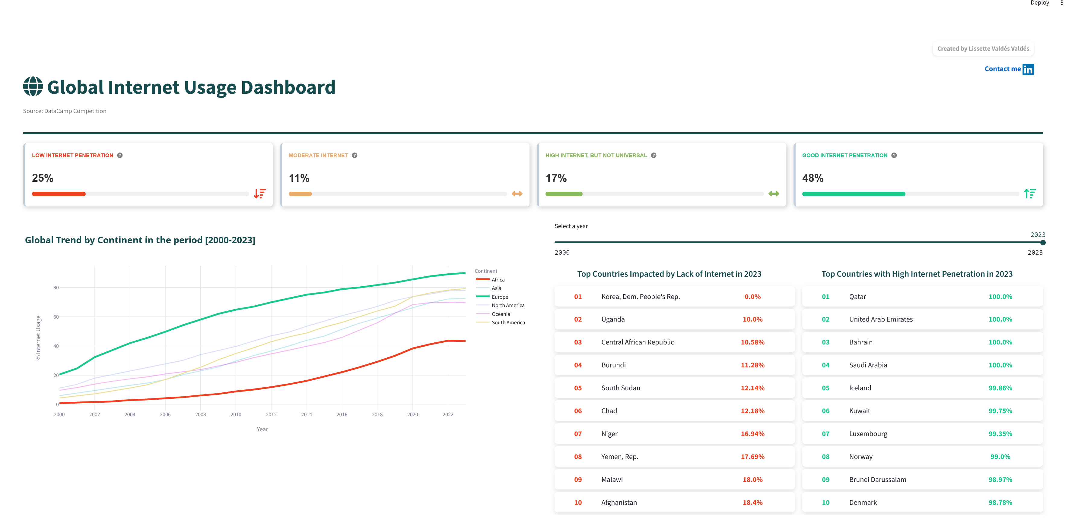
Global Internet Usage Dashboard
This dashboard project uses data analysis concepts to turn a large international dataset into an interactive story. The focus is not model training, but clear exploration, comparison, and communication.
Concepts used in practice: data cleaning, exploratory data analysis, aggregation, time trends, geographic comparison, interactive filtering, visual encoding, dashboard layout, and user-oriented communication.
Why it matters: a dashboard should help users ask better questions. The design choices support comparison across countries, continents, years, and economic indicators.

Restaurant Inspection Risk & Compliance Analytics
This project connects public API data collection with SQL-based analytical reporting. The methodological focus is building a reproducible path from raw inspection records to trustworthy compliance indicators.
Concepts used in practice: API data extraction, pagination planning, row-count validation, raw-to-cleaned data handling, CSV exports, SQLite database loading, schema design, SQL aggregation, conditional counts, percentage calculations, grouping by facility type, outcome, ZIP code, and inspection period, plus validation checks before analysis.
Why it matters: inspection data can easily produce misleading summaries if categories, outcomes, missing values, and inspection volume are not handled carefully. The project demonstrates how SQL can turn operational records into clear risk and compliance signals.
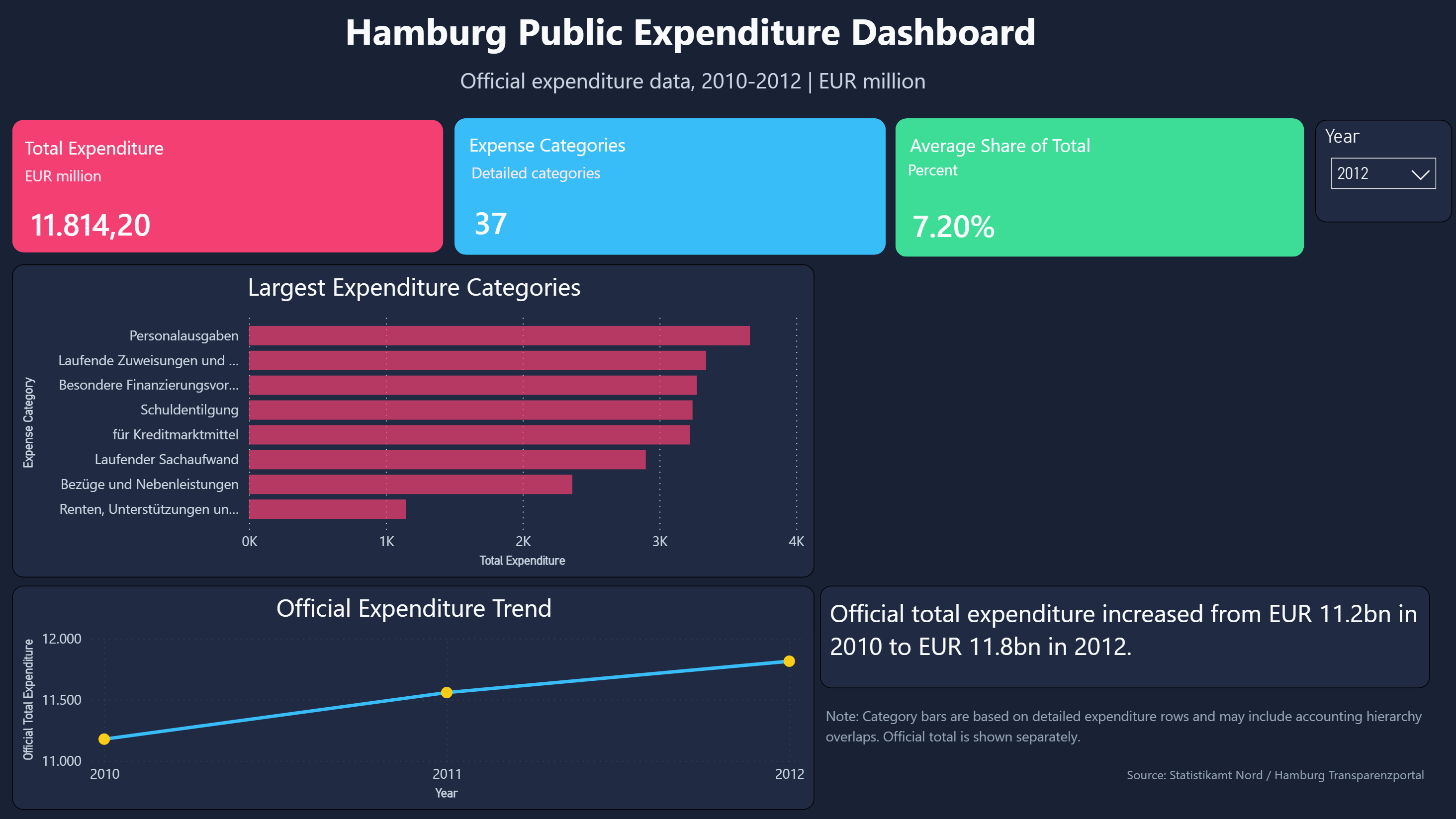
Hamburg Public Expenditure Dashboard
This Power BI project applies business intelligence methods to official public finance data. The focus is transforming a difficult statistical source table into a model that supports KPI reporting, variance analysis, and category-level drill-down.
Concepts used in practice: Power Query cleaning, delimiter and locale handling, wide-to-long reshaping, fact table creation, dimension table design, relationship modeling, DAX measures, KPI cards, variance analysis, slicers, visual hierarchy, dashboard layout, and source-data caveats.
Why it matters: financial dashboards need both accurate numbers and clear explanations. This project separates official totals from detailed category rows, documents accounting hierarchy limitations, and presents the result in a stakeholder-ready format.
Motivation-Based Participant Segmentation
This project connects unsupervised learning theory with a real clustering workflow: scaling features, comparing K-Means, hierarchical clustering, and DBSCAN, checking cluster stability, and translating algorithmic labels into interpretable motivation profiles.
Concepts used: K-Means, hierarchical clustering, DBSCAN, PCA visualization, silhouette score, dendrograms, cluster profiling, noise detection, and cautious interpretation with a small dataset.
How I Use These Notes
Each concept added here should answer a practical question from a real project: why a metric was chosen, why a feature was removed, why an outlier was treated, why a model was evaluated a certain way, or how a visualization supports interpretation.
This keeps the section close to applied data work and avoids turning it into a disconnected theory archive.